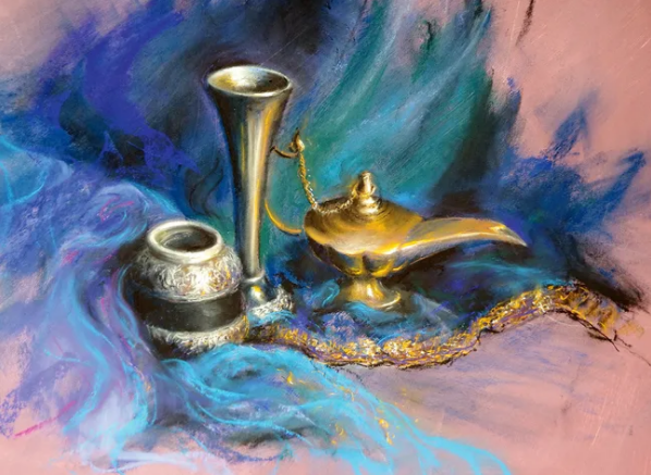
Back in 2017 I ran across an article from CreativeBloq titled 'How to add drama to your pastel artworks' written by Rebecca de Mendonça. The article features a still life painting: ornate brass bottles on a bed of richly textured cloth. Rendered in soft pastels, the finished piece is dreamy and vibrant, an effect that lodged itself into some part of my brain where it resides to this day.
Shortly after reading the article I ran out and bought some various student-quality pastel supplies. I hadn't done any research and was flying by the seat of my pants. I remember sitting down with a set of eight colors and laying them down on paper. At this point in my life I had learned the basics of several artistic mediums; how hard could it be to master these funny little sticks of chalk? I don't know if it was the pastel dust or my own hubris I choked on. It should come as no surprise that when I finished playing around I looked upon a muddy mess that would have given the local kindergarten students a run for their money. Annoyed at the medium, but mostly at myself, I shelved the pastels and tried to forget about them.
Fast forward to the present. The artist behind Nightjar Illustration, Adam Burke, is one of my inspirations. I love Adam's work, and was overjoyed to discover he is contributing artwork to a card game I've been playing. Upon seeing his artwork for the promotional version of a card, City of Glass, I was captivated in the same way as I was by Rebecca's artwork almost a decade ago. Despite knowing Adam's City of Glass was done with acrylics, the two wires crossed. I wanted to make an homage to Adam's piece, and thought the dreamy aesthetics of soft pastels would make a great fit. I dredged up that box of eight sticks again. This time, with a clear goal in mind, I set out.
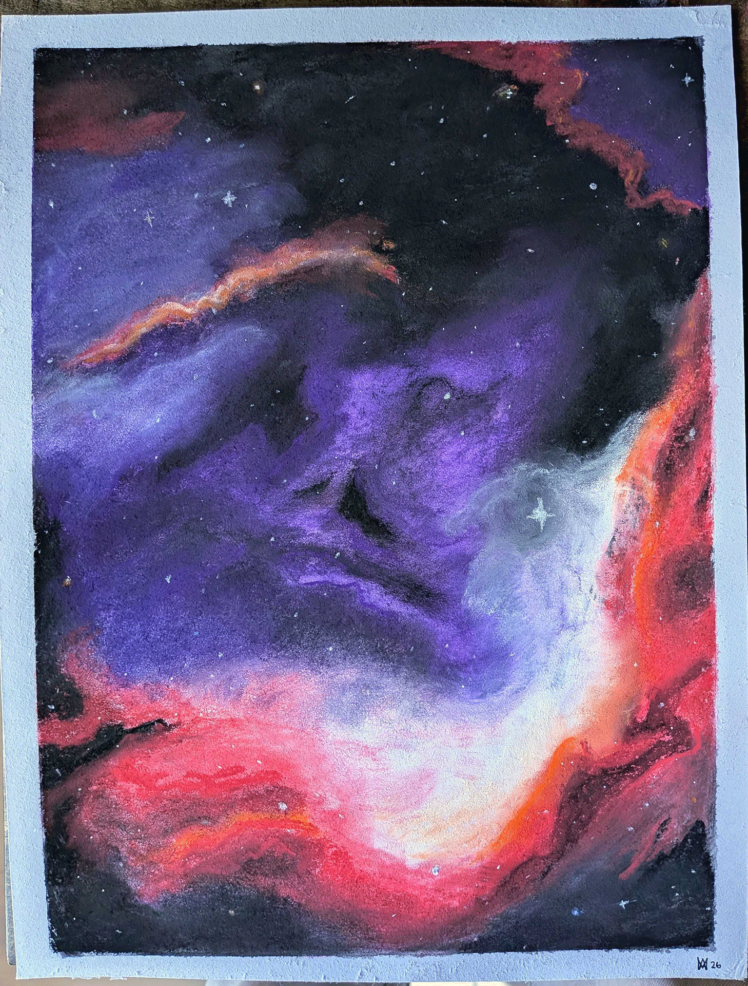
After lots of YouTube videos and some aimless doodling I gave it a serious try. I knew I didn't want to attempt my own City of Glass right away, so I did something similar. I was happier with this than I expected, and decided to keep it and give it a name: Pareidolia.
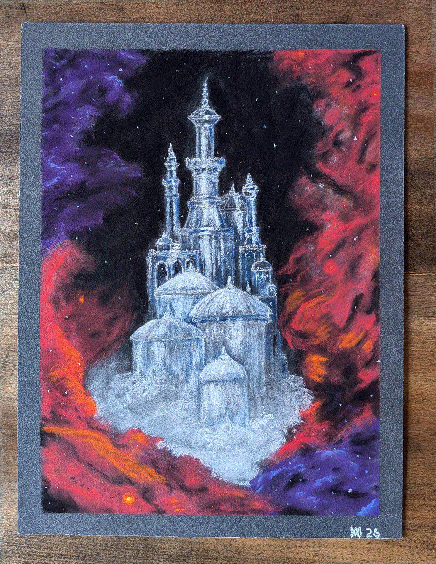
For my second project I purchased PastelMat paper, as the dry-media paper I used the first time around didn't allow for the kind of layering I'd read so much about. It also couldn't handle an alcohol wash underpainting, which I found to be quite fun and would like to continue doing. Using PastelMat was a completely different experience. Positive, but so different that I had to learn on the fly. While I am pleased with City of Dreams, I'd like to redo this one after a year or so of working with pastels.
My third endeavor will be on PastelMat again, but with Sennelier Extra Soft Pastels and a different color palette. Probably yellows or greens.